

Uversity Referral Program
"Self-serve in-product referral service for educators”
Problem Space
From user research, we learned that trust is one of the biggest barriers to user adoption. In order to create trust, one of the core strategies is via word of mouth or referrals. Previously, the sales team handled referrals manually and it was not sustainable or scalable.
Project Overview
The goal of this project is to create an in-house referral program so that educators can refer fellow educators. By receiving a referral from someone you know, we expect to increase user acquisition.
Outcome
Decreased cost per acquisition by 70% and reached 100 referrals within first 90 days of launch.
Referral traffic has significantly higher verification and upload rate.
Top 3 most used features on Uversity.
Role
Lead designer
Duration
1 month
Tools
Figma
Team
UX, PM, Sales, Eng, BizOps, Legal
1 | Objective & Process
The goal for building a referral program is to build trust with educators who are skeptical of the Uversity platform since it is a brand new product less than one year old. Referrals allow us to incentivize early adopters to drive awareness and growth.
Hypothesis: The referral program would incentivize active users to spread product awareness with their colleagues hence increase user acquisition.
Metrics: User sign-ups and verification
Design process
Discovery (requirements, scope, research)
Brainstorm & Ideate
Usability test
Stakeholder review
Iterations
Hand-off

2 | User Research
Partnering with my research partner, we conducted 5 user interview sessions focusing on the following questions:
Experience with referral programs in general (expectations, likes/dislikes)
Initial thoughts on designs (usability, discoverability, likes/dislikes, general thoughts)
Key findings
1. Designs are clean and easy to use.
2. Desire to see referral progress and status.
3. Would like to see referral as it’s own menu item
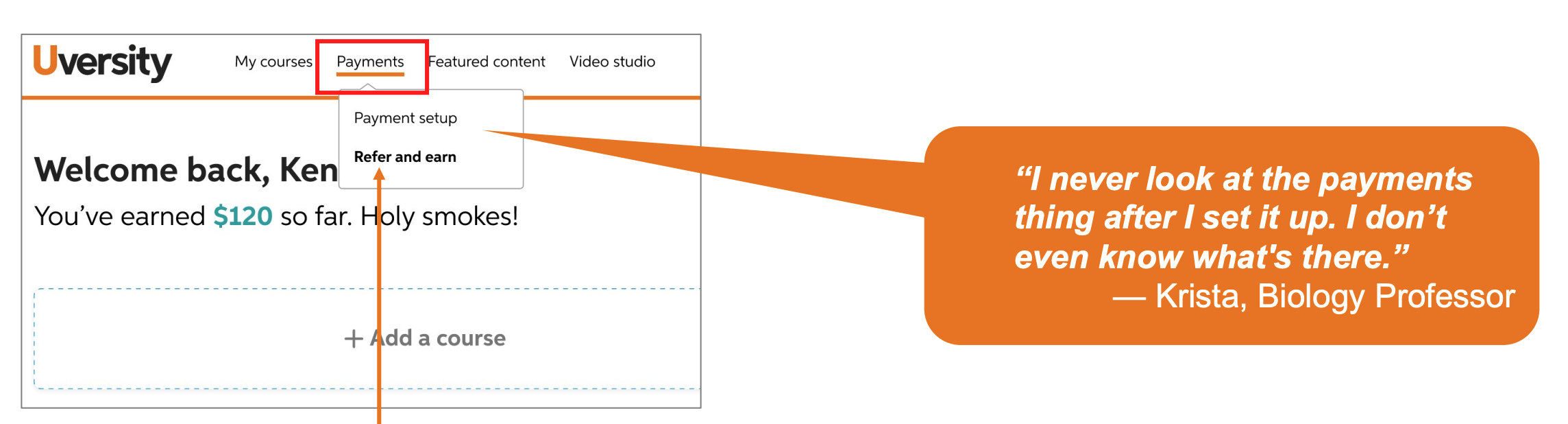
One of the key learnings from research was that users did not expect to see referrals nested under payments. As a result, we iterated on the navigation and added referral as its own menu item.

Overall users had positive feedbacks around the page layout and content.
3 | Ideate & Wireframe
From our user research insights, we identified and organized every type of information that clinicians want to see. We then mapped out the user flow and laid out a system blueprint to understand behind the scene interactions.
Challenges
Over the course of my design process, there were many obstacles that I had to work through. For example, this project had dependencies on multiple teams (finance, legal, engineering, bizops) and none of the teams had launched something like this before. As a result, I had to lead the conversations with designs and visuals to guide our focus and move the project forward. In addition, we had to pivot half way as the engineering team learned that we cannot accomplish one of the initially desired capabilities. As the lead designer, I had to be flexible and move fast with the changing requirements to cross the finish line.
Early iterations


Final designs

Responsive designs

4 | Measuring success
After the first 90 days, we say strong signals on multiple areas:
Lift in document upload rate
Lift in onboarding success rate
Higher quality leads
Higher new user verification rate